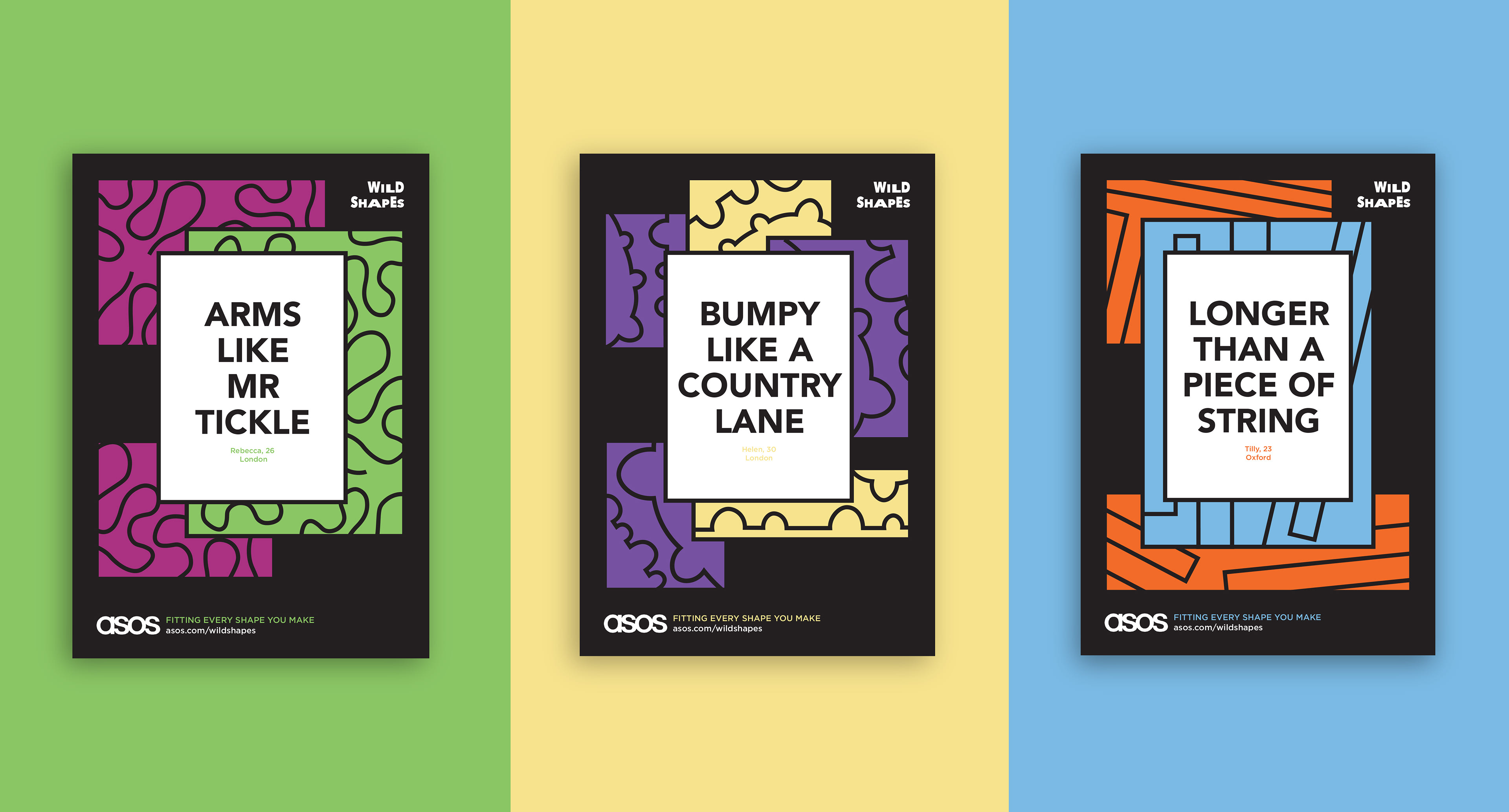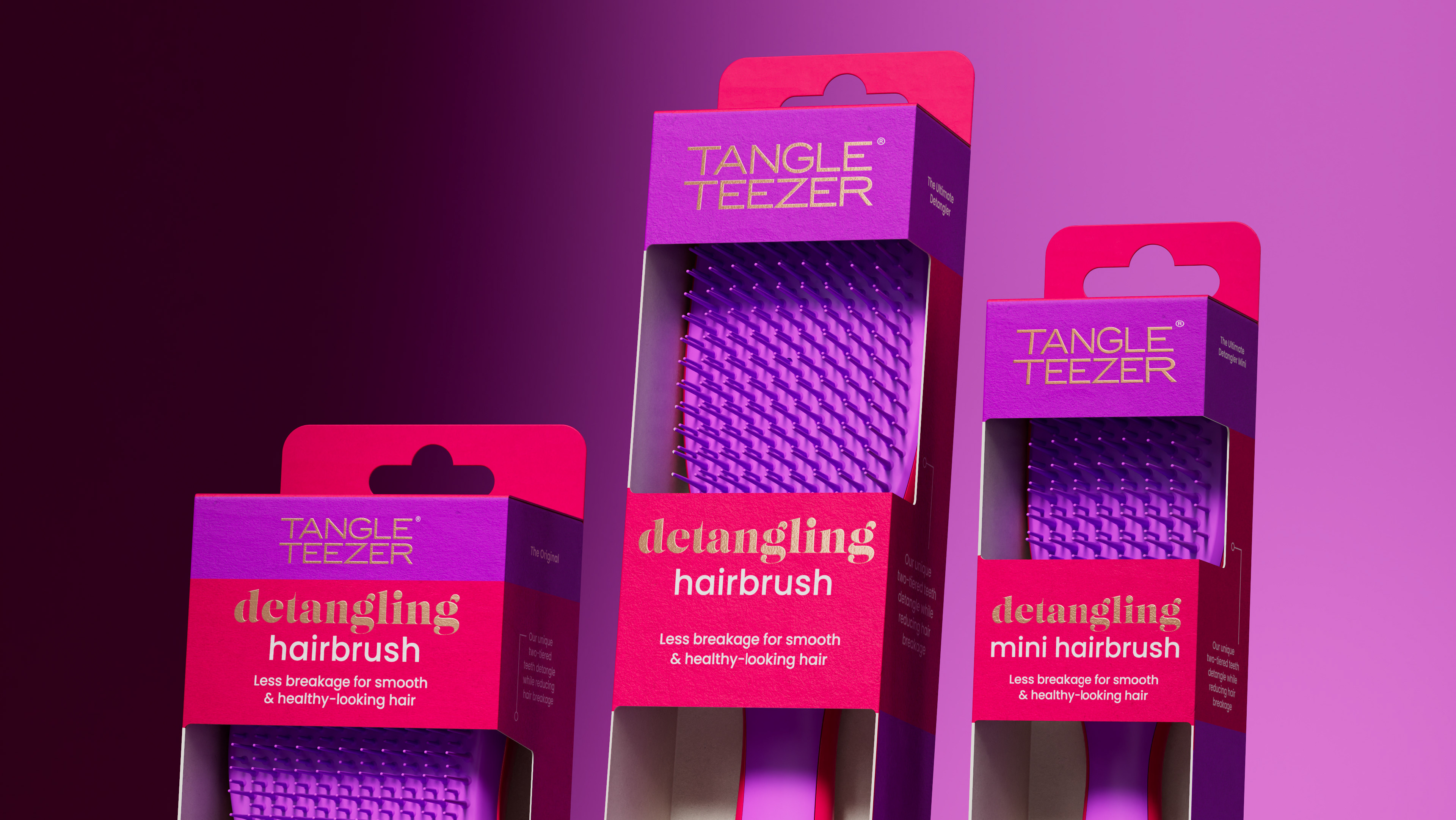
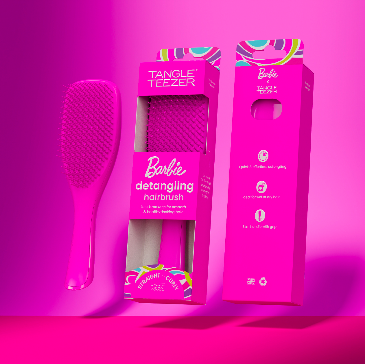
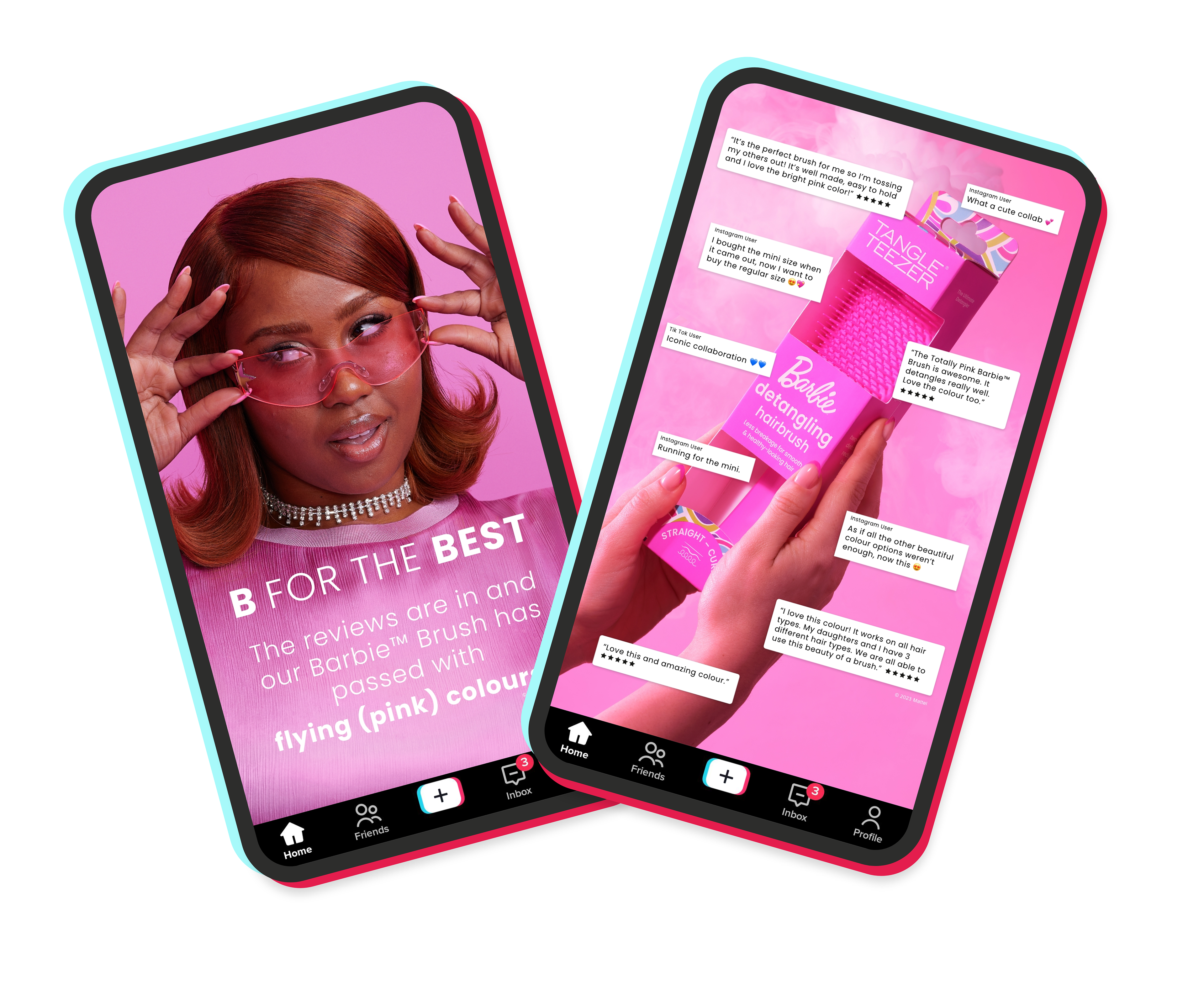
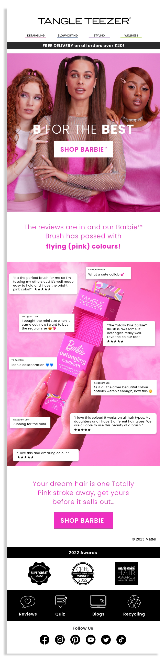
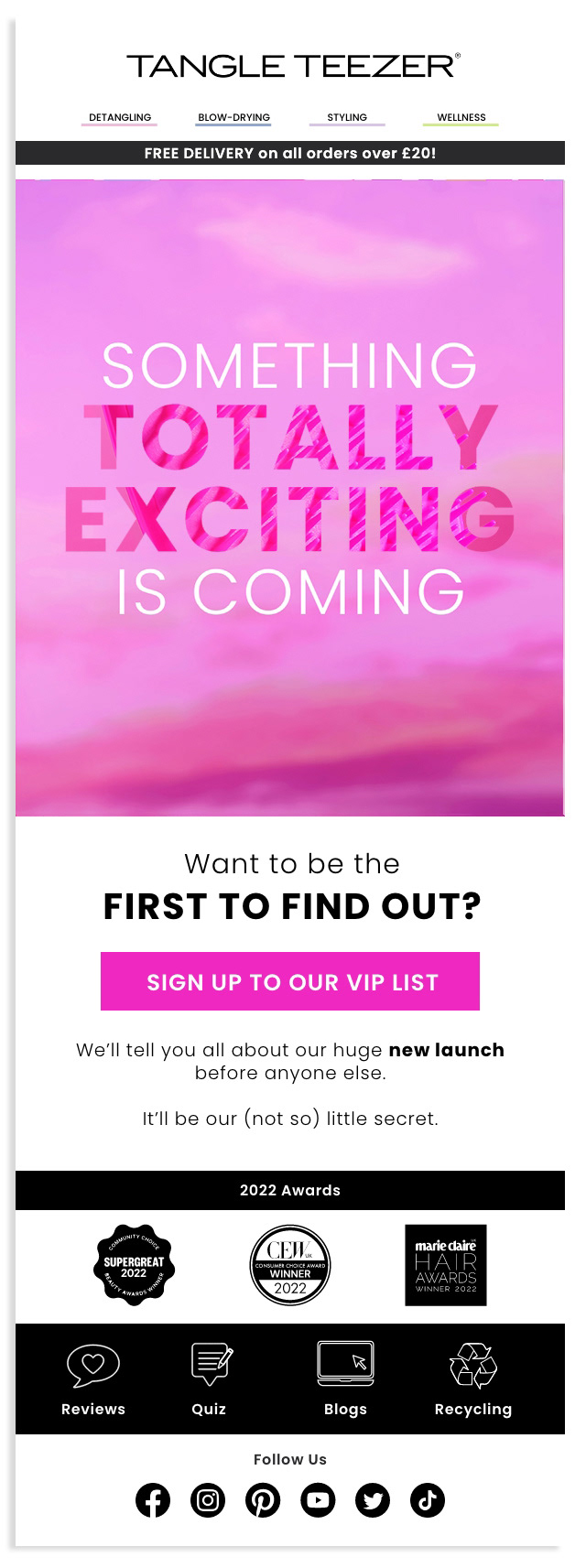
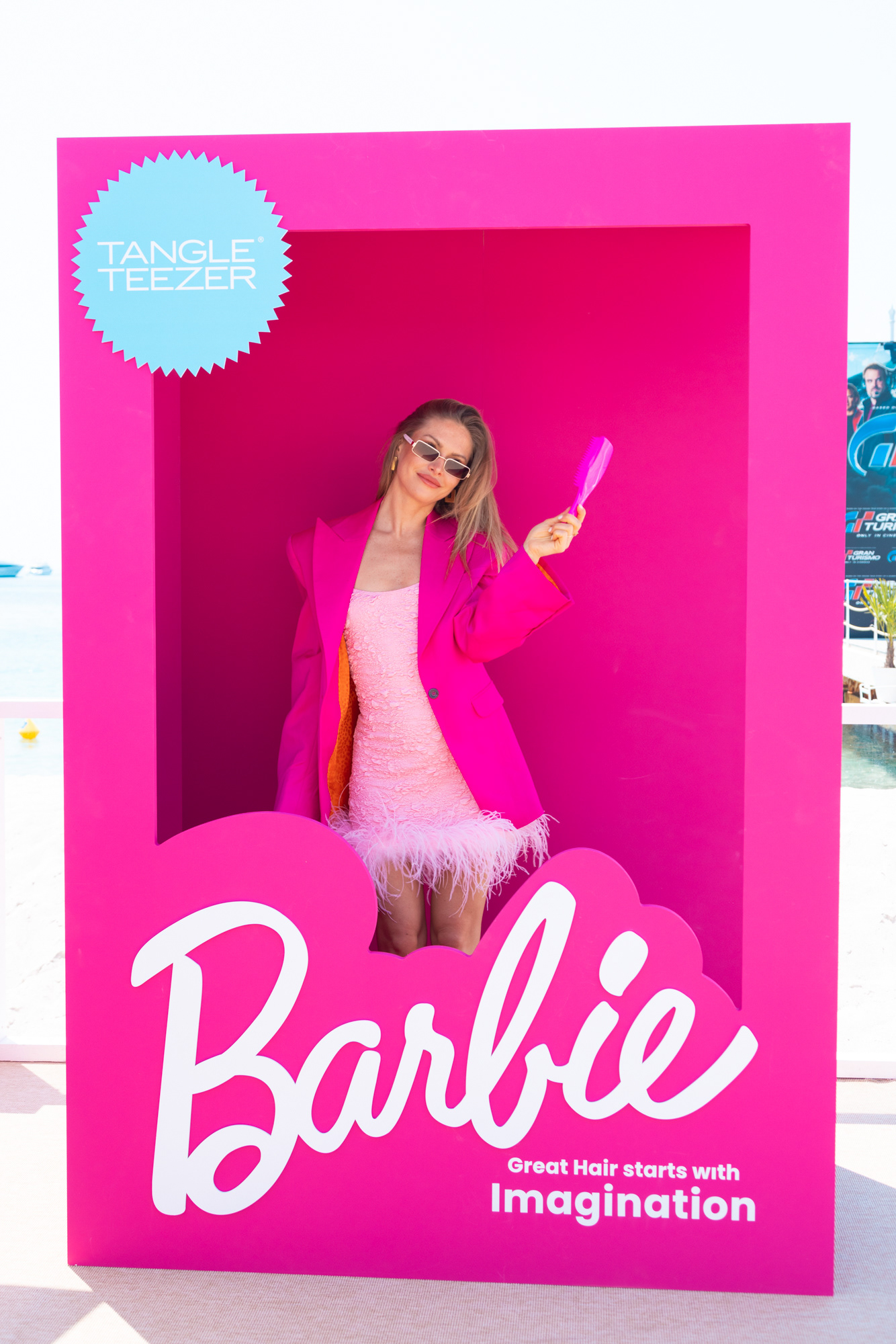
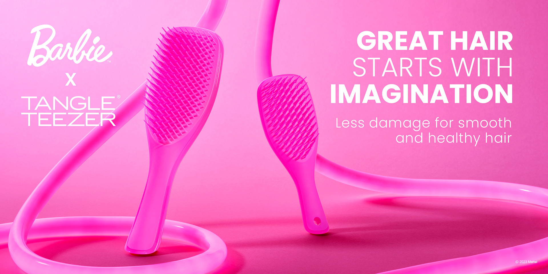
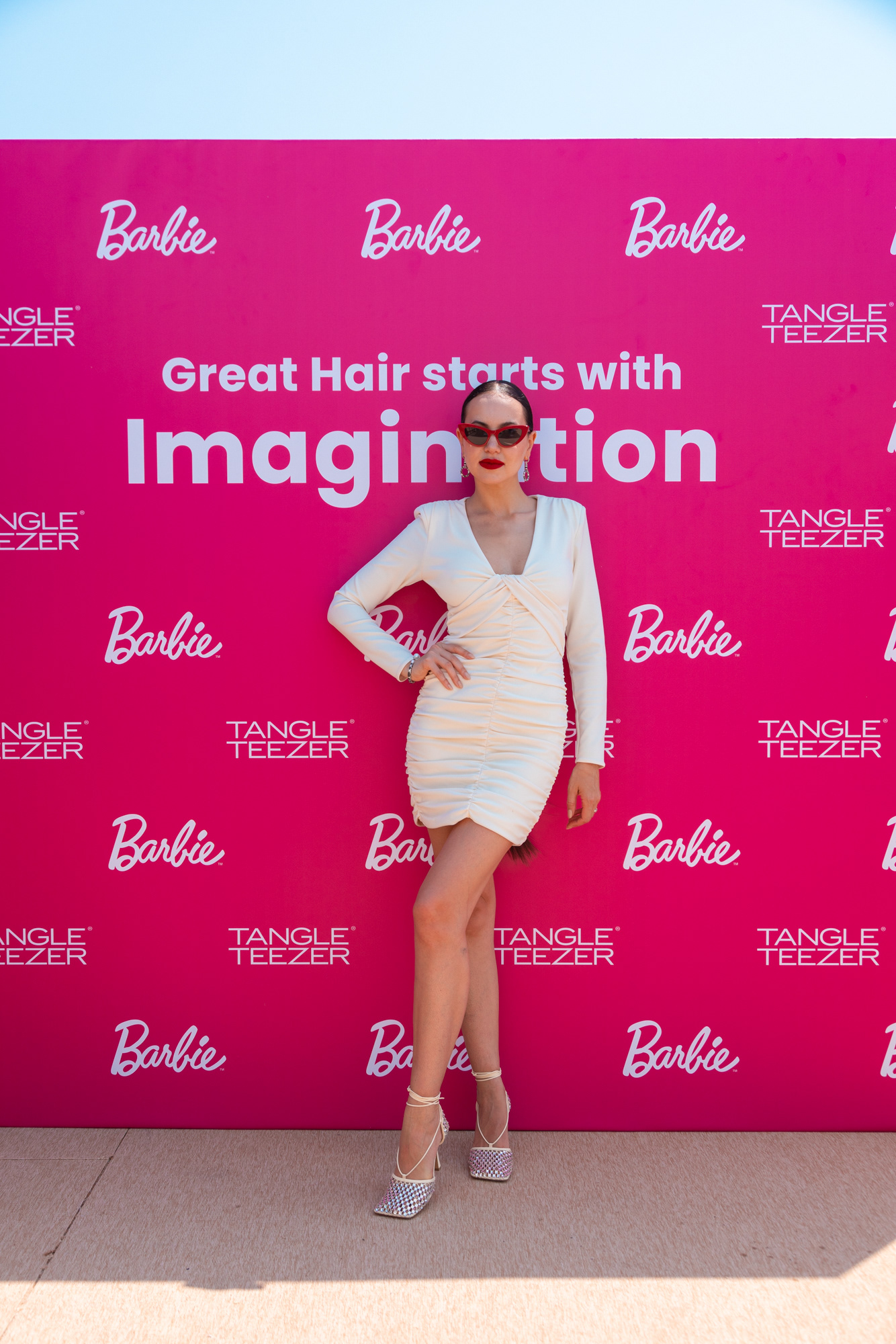
Spotlight 1: Barbie x Tangle Teezer
Colour Concept, Packaging Design & Design Direction for Print & Digital
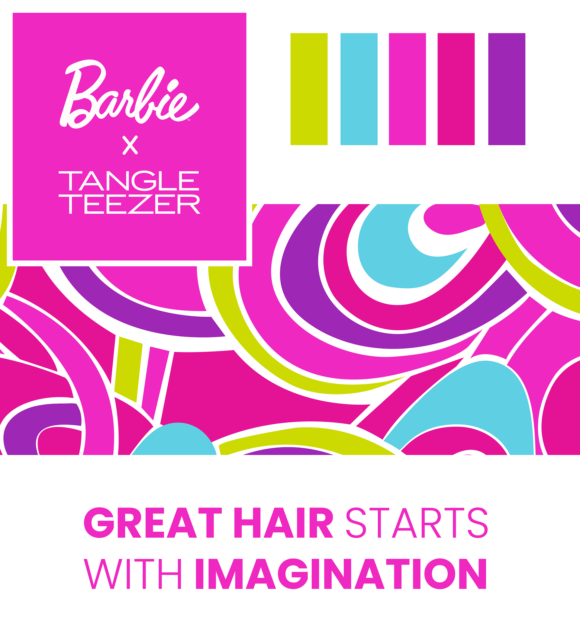
Tangle Teezer & Barbie are both iconic brands which inspire nostalgia in our Millennial and Boomer customers and unapologetic femininity in our Gen Z customers.
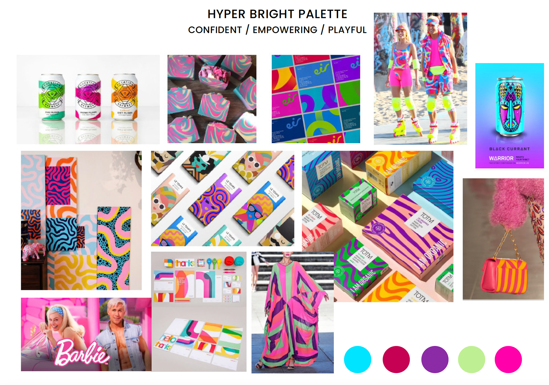

We wanted mesh our two consumer bases by re-inventing an iconic Barbie print (Totally Hair) with a trend-led and fashion inspired palette. We refreshed the palette with our take on Valentino's striking pink from their A/W 22-23 collection; this was used as our hero campaign colour and brush colour. We added cyber lime, aqua, hyper bright purples and pinks to give a dopamine inducing selection of colour.
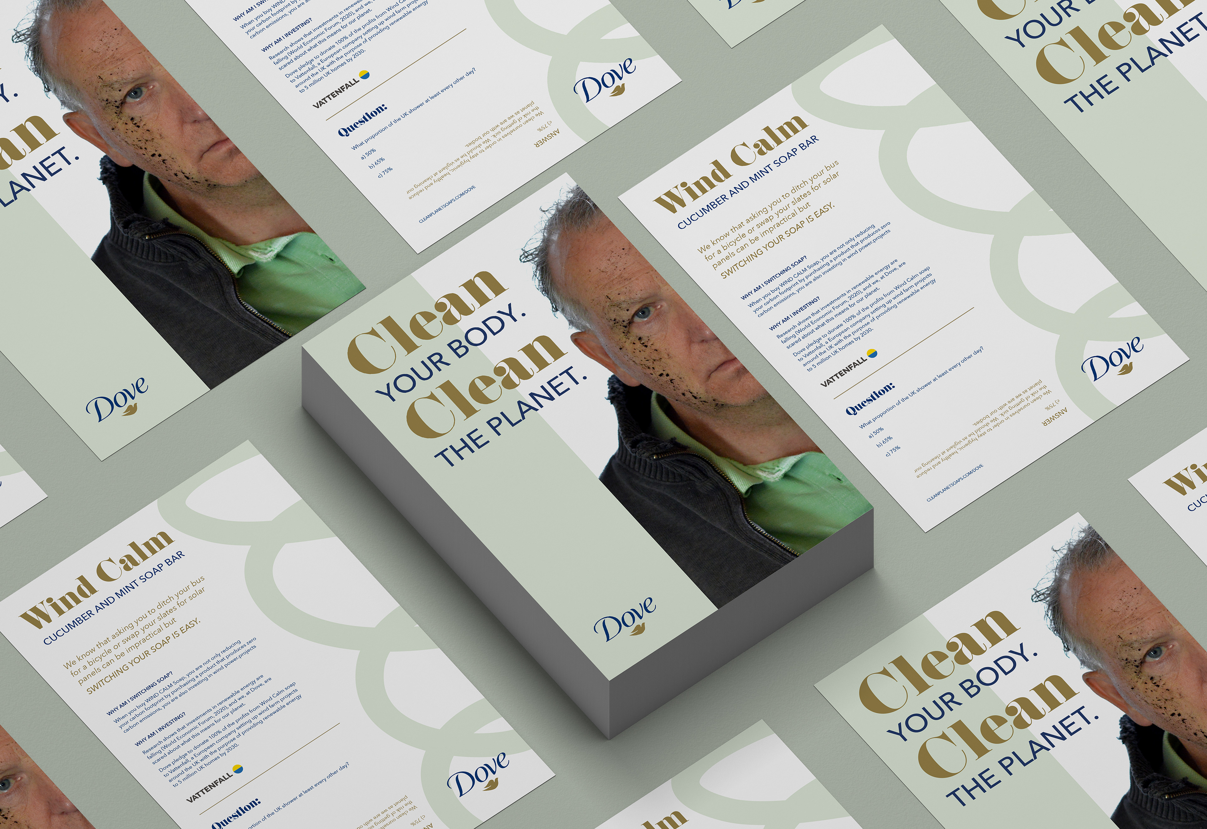
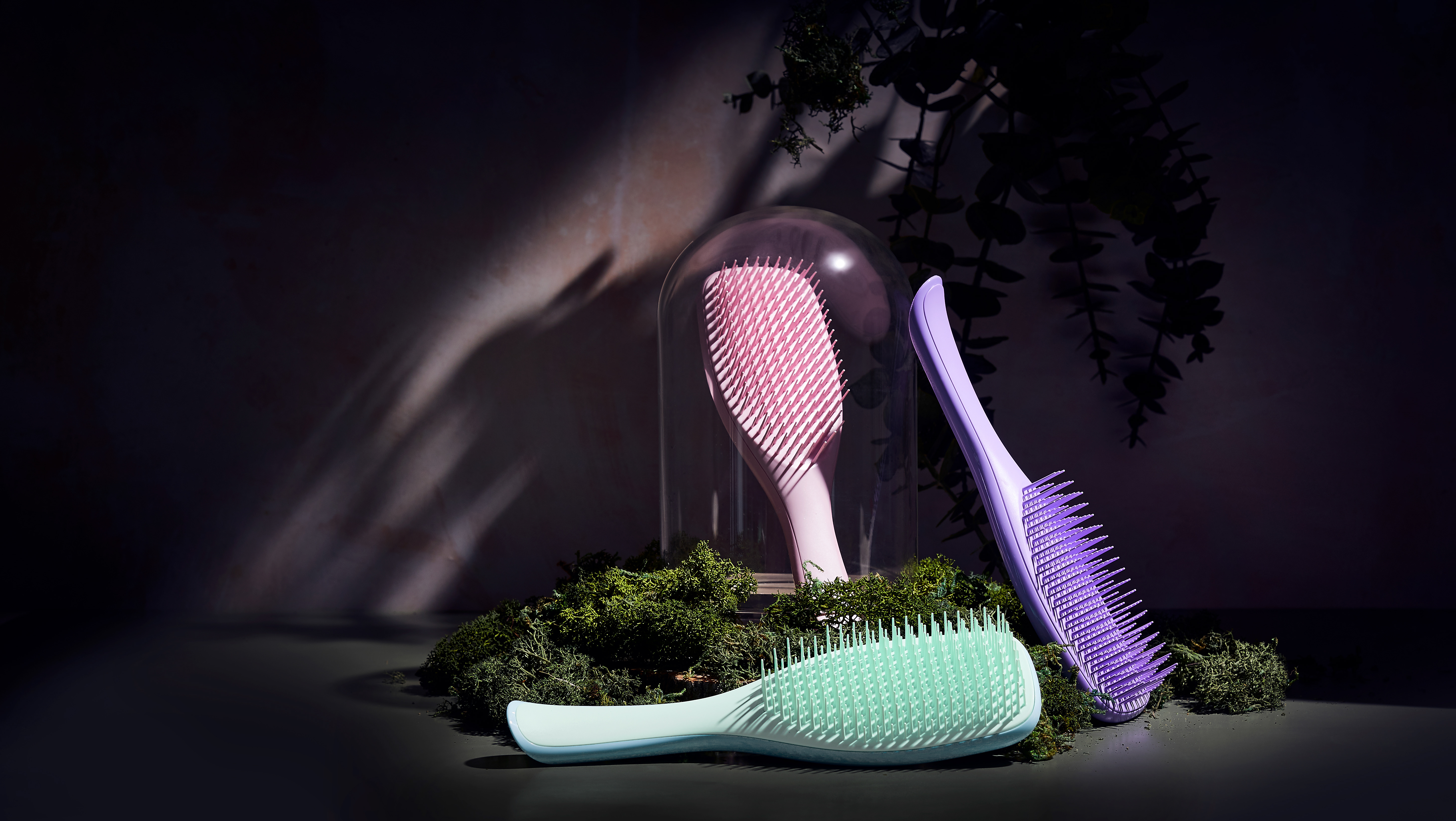
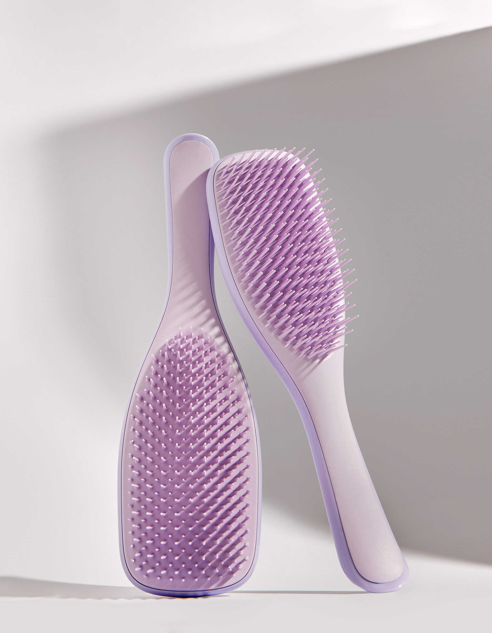
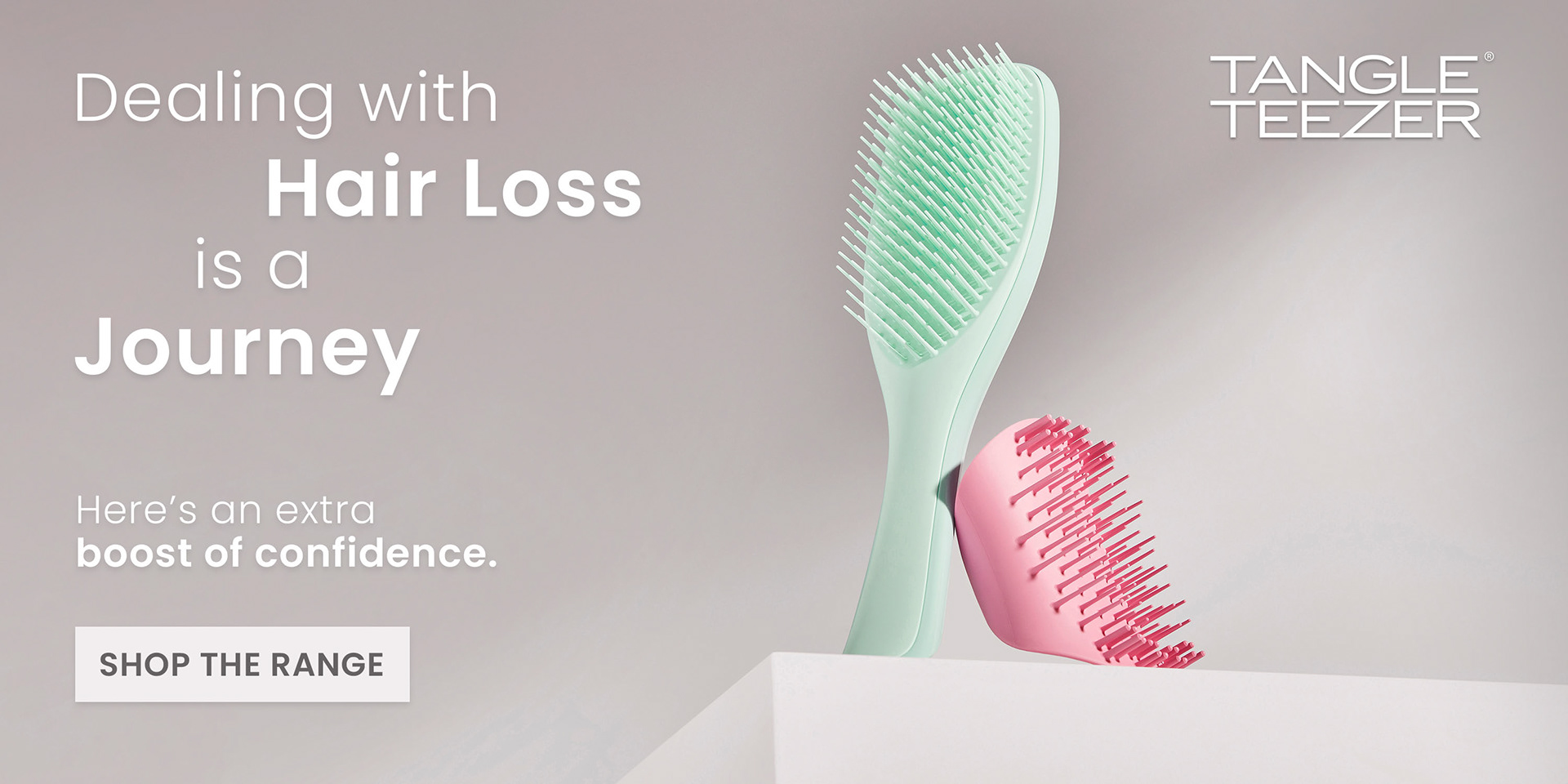
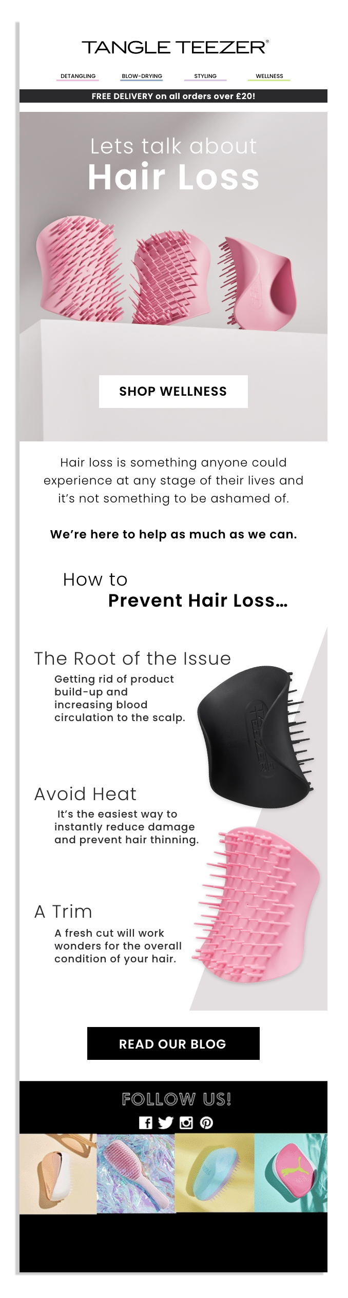
Spotlight 2: Hair Loss Campaign
Art Direction & Design Direction for Digital Assets


This campaign was designed around giving our consumers comfort in knowing we see and understand the fears and concerns around hair loss. We wanted the photography to feel soft and gentle in colour to emulate how our products care for your hair. However, we placed the products in a power stance, shot from low to high or with strong, confident shadows to provide assurance of their capabilities in helping consumers cope with hair loss.

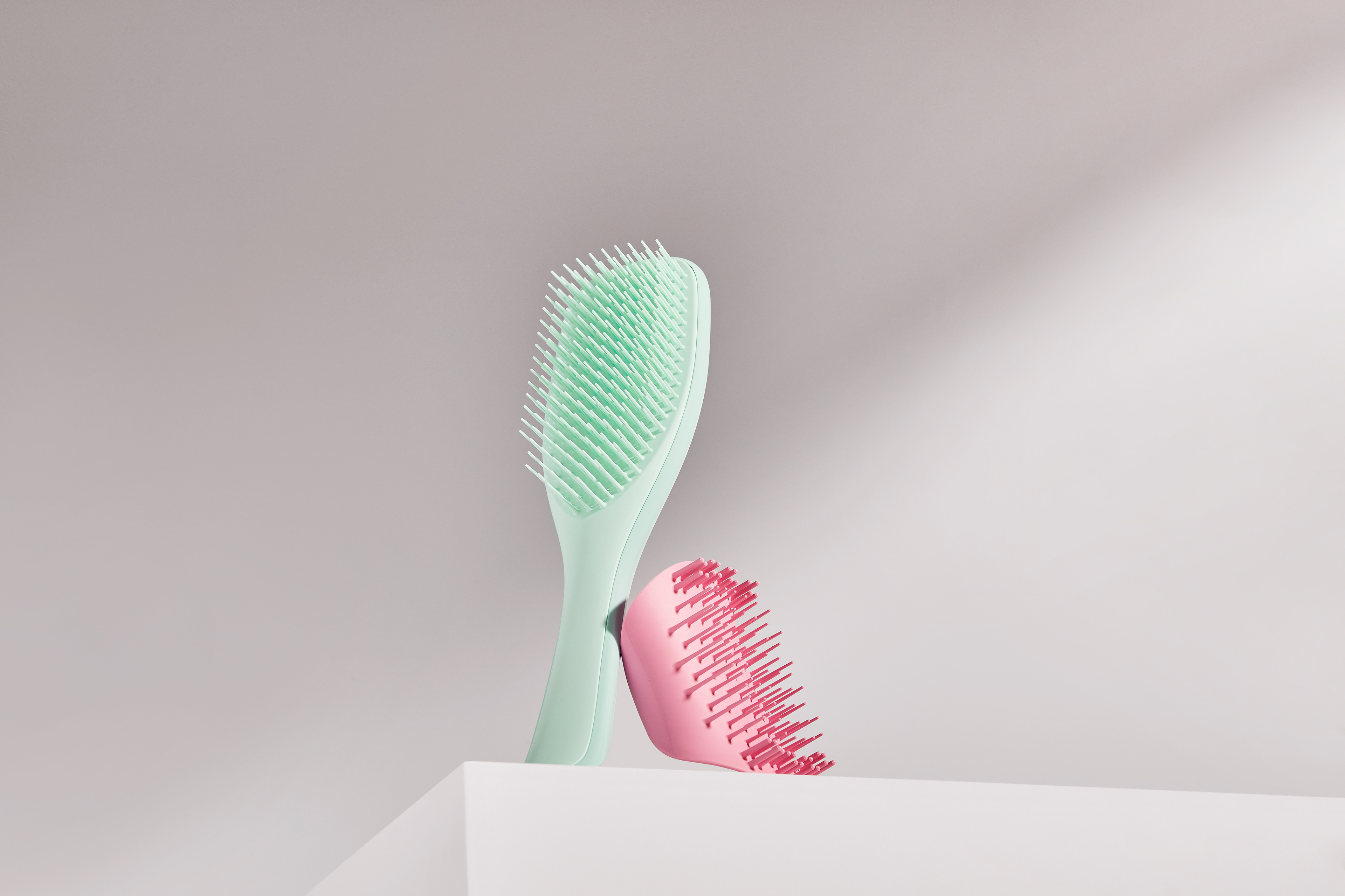

When applying typographic treatment we chose to remain with our brand font Poppins but adapt it to suit the campaign style. In a similar theme to the photography we elected for a thin font for supporting words but for our key words we wanted to give confidence through bold treatment. We styled the shape of the typography to show a confusing and uneven journey, similar to those experiences of hair loss, however this uneven headline led to our sub header "Here's an extra boost of confidence", a strong final destination.
Student campaign projects